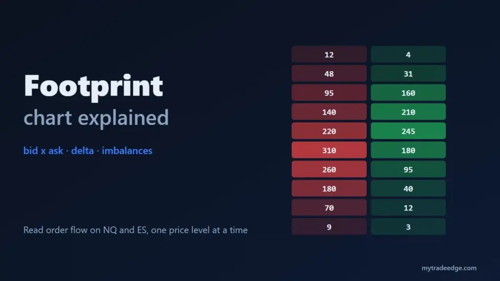
A footprint chart is a candlestick chart opened up: instead of one bar per minute, it shows how many contracts traded at every price inside that bar, split into volume that hit the bid and volume that lifted the ask. From those two numbers you get delta, imbalances and the point of control, the building blocks of order flow trading.
On fast markets such as NQ and ES futures, a footprint shows who was aggressive at each tick and whether that aggression moved price. This guide explains how to read a footprint bar, how diagonal imbalances are calculated, and four patterns worth learning first, with NQ examples.
What does a footprint chart show?
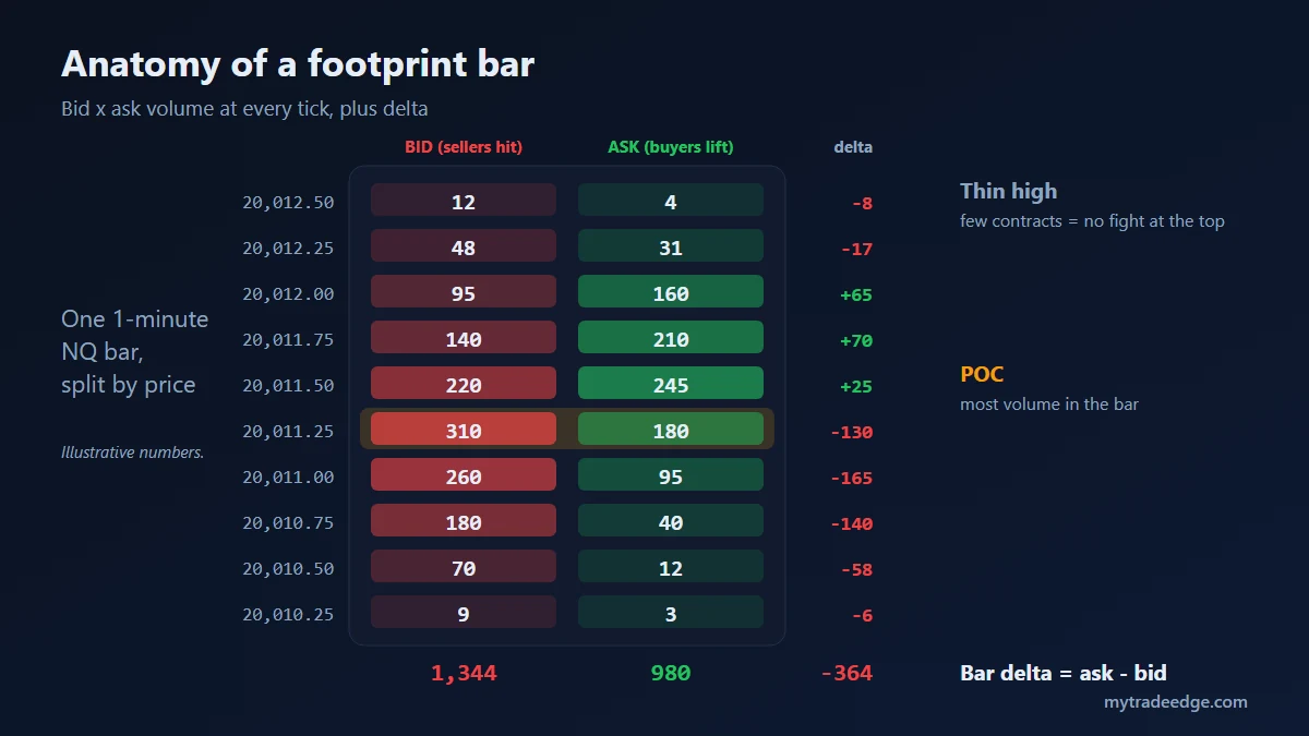
Each row of a footprint bar is one price level, and each row has two numbers. The left number is volume traded at the bid, meaning sellers who hit the bid with market orders. The right number is volume traded at the ask, meaning buyers who lifted the offer.
On NQ the rows are 0.25 points apart, the minimum tick (CME Group). In the illustrative bar above:
- Volume at each price. At 20,011.25, 310 contracts traded on the bid and 180 on the ask.
- Delta per row. Ask minus bid. At 20,011.25 that is 180 – 310 = -130, so sellers were more aggressive there.
- Bar delta. The sum for the whole bar: 980 – 1,344 = -364.
- Point of control (POC). The row with the most total volume, here 20,011.25 with 490 contracts.
- Thin extremes. Only 16 contracts at the high (12 + 4). Very small volume at an extreme suggests price ran out of interest there.
A normal candlestick would show this bar as a small range with a close near the middle. The footprint shows that the lower half was dominated by selling.
Bid x ask, delta and volume profile: how are they different?
All three come from the same trades but answer different questions. Bid x ask shows who was aggressive at each price. Delta reduces that to one net number. Volume profile drops the split and shows only where the most contracts traded.
| View | What it shows | Question it answers |
|---|---|---|
| Bid x ask footprint | Aggressive sells and buys per price | Who was hitting the market, and where? |
| Delta footprint | Ask minus bid per price or per bar | Which side was more aggressive, net? |
| Volume footprint / profile | Total contracts per price | Where did the market accept price? |
| Cumulative delta | Running sum of bar delta | Is aggression building or fading over time? |
If you use volume profile levels already, for example high-volume nodes as in our MULTI_HVN strategy breakdown, the footprint is the close-up of what happens when price returns to those levels.
How is a diagonal imbalance calculated?
An imbalance compares ask volume at one price with bid volume one tick lower, not on the same row. When the larger side is at least a set multiple of the smaller one, commonly 3 to 1 (300%), the level is marked as a buying or selling imbalance (LuxAlgo, bid/ask imbalance).
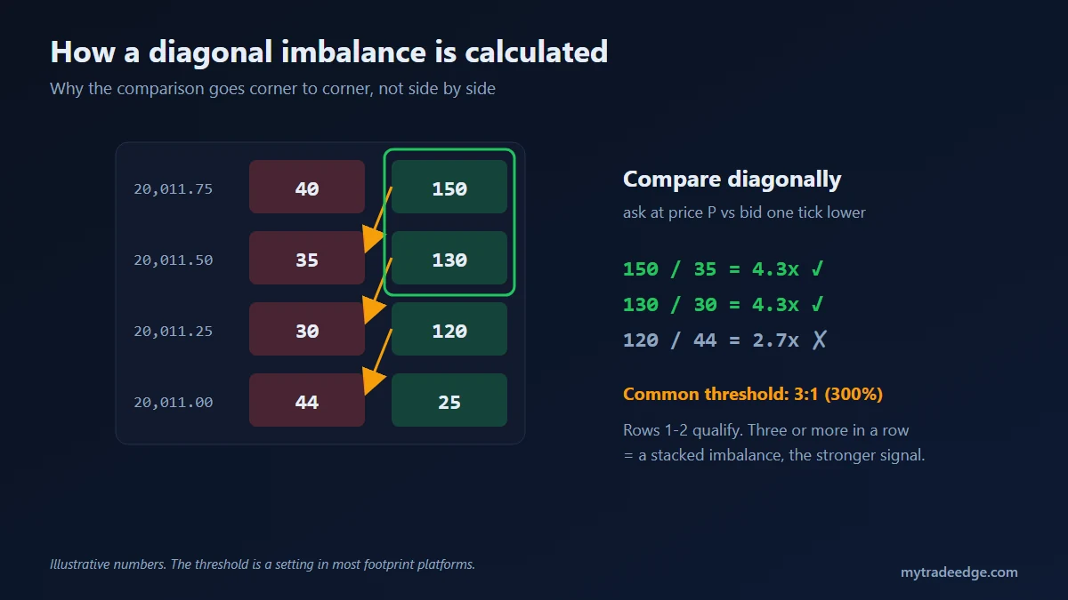
The comparison is diagonal because of how the order book works. A buyer lifting the offer at 20,011.75 is trading against sellers at that price, while a seller hitting the bid at that moment trades one tick lower, at 20,011.50. So the fair comparison is 150 on the ask at 20,011.75 against 35 on the bid at 20,011.50: 4.3 to 1, a buying imbalance.
In the example, two rows qualify. When three or more consecutive rows show imbalances on the same side, traders call it a stacked imbalance. A single imbalance is common and often means little; a stack suggests one side was aggressive across several ticks in a row.
The threshold is a setting in most footprint platforms. Keep it the same for months so your observations stay comparable.
Which footprint patterns should you learn first?
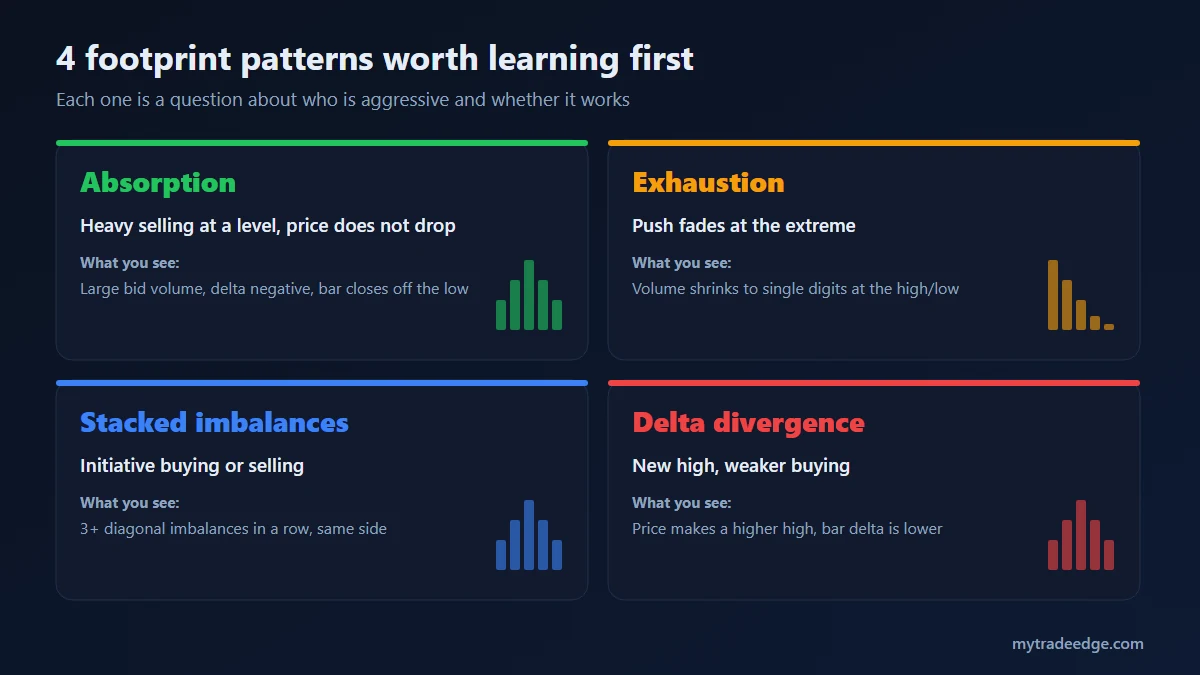
Start with four: absorption, exhaustion, stacked imbalances and delta divergence. Each one is a question about who was aggressive and whether that aggression moved price.
Absorption
Heavy aggressive selling at a level, but price does not go lower. You see large bid volume and negative delta, and the bar closes off its low. Someone with passive buy orders is taking everything sellers send. At a key level, such as the prior day low, it can mark a turn. Without a level, it is just noise.
Exhaustion
A push into a new high or low where the volume at the extreme prints in single digits. Aggressive traders stopped showing up. It is a warning, not an entry, until price confirms by moving back.
Stacked imbalances
Three or more diagonal imbalances in a row on the same side. They show initiative: one side moved price through several ticks with market orders. Traders often watch whether price later returns to that zone and holds it.
Delta divergence
Price makes a higher high but the bar delta is smaller than at the previous high (or the reverse for lows). Price moved, but with less aggressive buying behind it. Divergences fail often in strong trends, so treat them as context.
How do you use a footprint chart on NQ and ES?
Use the footprint only at levels you marked before the session. On its own, a footprint shows hundreds of numbers per minute; at a planned level, it answers one specific question: is this level holding or breaking?
- Mark levels before the open. Prior day high and low, overnight high and low, VWAP and the main volume nodes. Our pre-market checklist covers this.
- Wait for price to reach a level. Ignore the footprint in between.
- Read one bar or two. Absorption or exhaustion at the level supports a reversal; stacked imbalances through the level support a break.
- Set the stop beyond the pattern, for example a tick or two past the absorption extreme.
- Log the pattern as a setup tag in your trading journal, so after 30 to 50 trades you know whether it works for you.
Timeframe matters. On NQ, the number of contracts inside a 1-minute bar changes a lot between the 9:30 ET open and the midday hours, so the same pattern can mean different things at different times. Some traders switch to volume-based or tick-based bars so that each bar holds a similar amount of activity.
What are the limits of footprint charts?
A footprint records trades that already happened. It does not show resting limit orders that never traded; for that you need the depth of market (DOM) or a heatmap. It also cannot tell you why a trade happened: a large print on the bid can be a new short or a long closing out.
Other practical limits:
- Data quality. The bid/ask split depends on the data feed classifying each trade correctly. Low-quality or aggregated feeds blur it.
- Information overload. Reading every number in real time leads to overtrading. Use a few patterns at a few levels.
- No edge by itself. A pattern needs a level, a stop and a sample of trades before it counts as a method. Test it before you trade it, for example with the MyTradeEdge backtest engine.
Key takeaways
- A footprint chart splits each bar into bid and ask volume at every price.
- Delta is ask minus bid; the POC is the price with the most volume.
- Imbalances compare diagonally, with 3:1 as a common threshold; stacks of three or more matter more than single ones.
- Read the footprint only at levels you planned, and log every pattern so you can measure it.